Indesign | Driedubbele lijn om letters via Editable text
Perfecting the Triple Outline with Editable Text

outlineb1
Last week I posted a tip on how to create double outlines on text, while maintaining the text’s editability (that is, without converting the text to outlines). Today, jetlagged after my trip to Japan, and preparing for the RefineDesign conference tomorrow, I found another way to do it… a method that would be in several ways better than the previous trick! For example, this technique lets you have as many outlines as you want, instead of just two. Plus, the outlines are always vector, instead of the high-resolution bitmapped outline built with the glow or shadow effect.
The downside is that the effect is created using multiple text frames, each with its own text in it.
- Create some text and apply a character style to it ("text with outline" in my example).
- Choose Type > Text Variables > Define, and create a new text variable that picks up the first instance of this text on the page with the character style you just built. (This is a CS3-only feature.)
- Draw a new text frame and, with the Type tool flashing in it, choose Type > Insert Variable > [name of the variable you just made].
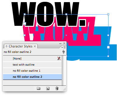
- Now create a new character style that is based on the one you created earlier, but with a big, thick stroke. In this example, I used a magenta stroke and a fill of None. I called the character style "no fill color outline 1″
- Apply that style to the variable. Notice that each time you edit the original text, the variable changes, too! (You may have to redraw the screen to force an update.)
- Use the Align panel (or the Align buttons in the Control panel) to align the top and left of the two frames (the original text and the duplicate variable). Use the Object > Arrange submenu to make sure the variable frame is behind the original text.
- To make a third outline, repeat steps 3-6, but make the outline even thicker.
- Group all the frames so they move together.
Sound like a lot of steps? Well, once you do it once, you can easily make a snippet out of it (or put it in a library) so you can reuse it as many times as you want. Just change the character style definitions and you have a different look!
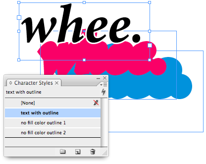
Here’s all three frames stacked (but not yet aligned):
outlineb2
outlineb3
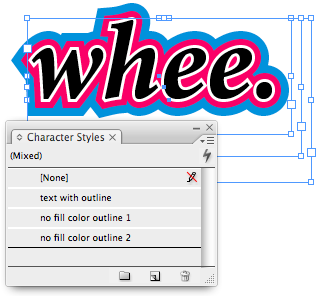
Here’s how it looks when the frames are aligned:
outlineb4
Is this a perfect solution? No, of course not. Converting to outlines still gives you far more control over the stroke. More importantly, it lets you adjust the join mitres so that you don’t get weird pokey things sticking out at sharp corners. But with this method, you have to still live with those icky points:

outlineb5
Nevertheless, I still like the idea of being able to
keep the text editable. So until we can adjust the Stroke panel
properties on stroked text, this is as close as we can get. Besides,
it’s a fun (and unexpected) use of CS3’s Text Variables feature.
Okay, that’s it. I promise to lay off the outlines for a while. Jeez!